T H I R D C U TFEEDBACK: the security camera shot in the interrogation scene should be in black and white with crediting taken away in order to add a sense of realism to the shot.
0 Comments
in depthL O C A T I O N R E C C E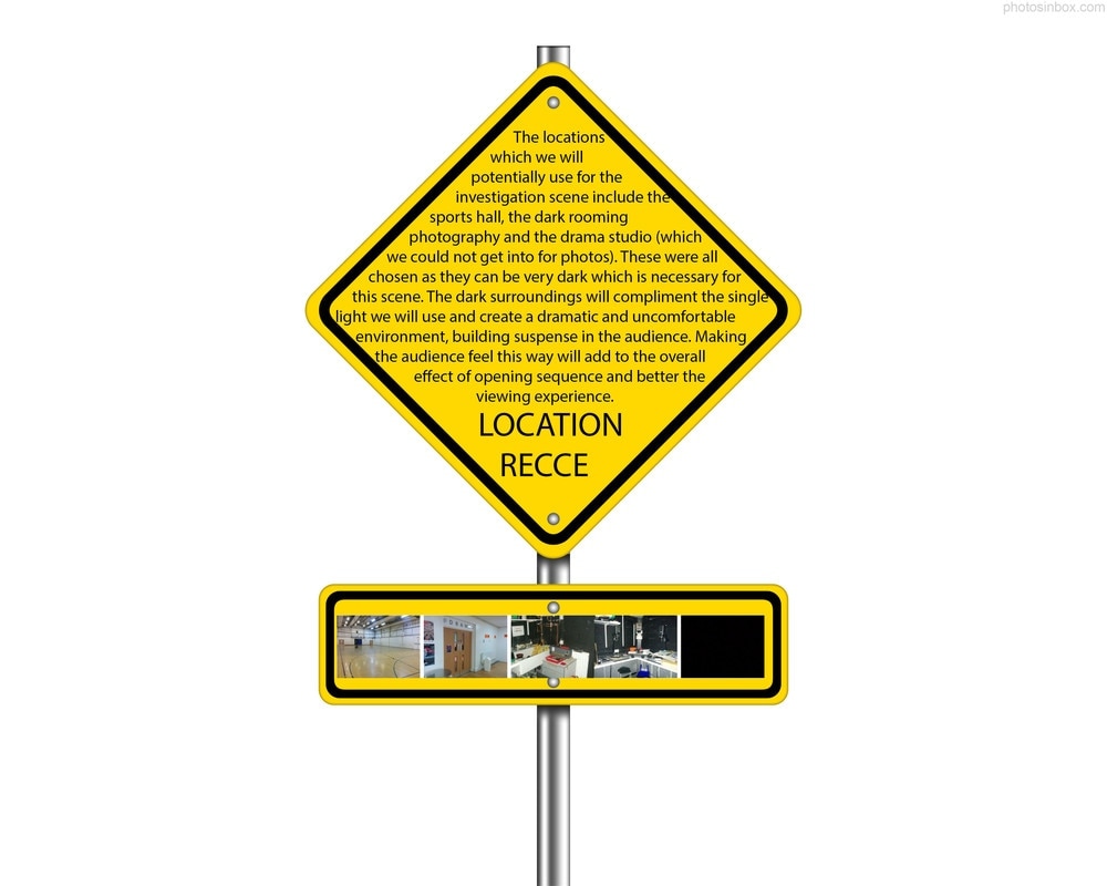 As well as shooting in school for the interrogation scene we have decided to shoot up in London in Carnaby Street and other neighbouring streets. By shooting up in London the character being portrayed is seen as having some sort of status. The location in which it is shot in implies that the character is some sort of business man with serious intentions. The use of key features of London in the shots helps the viewer to recognise the setting and make connections between the character, plot and location based on stereotypes about people from this area. The outside shots also juxtapose nicely with the ones of the interrogation scene as one is very open and light with the other shots being enclosed and dark.
C A S T I N G
F I R S T C U Tfeedback we were told that the fonts and graphics we used in this didn't suit the style of the movie so this was changed in the second cut. We also got feedback that the inspector's dialogue was too loud with no surrounding sound so had to be re recorded in order to make it feel more realistic.
C O M P A N Y I D E N TBy creating this company ident, our production comes across as more professional and therefore more reliable. This is because both independent and blockbuster productions use the logos or ident of one or more companies associated with the production of the film as a form of identification and appreciation.
We chose to use a camera in the company ident seeing as it relates to filming and creating movies. The fact that the camera is running makes the audience get ready for the feature, building suspense while also advertising our production company. We used a mixture of both bold fonts and a scribbled, handwritten font in order to show that the company was professional but also run by a conventional group of students. The handwritten font on a lined background emphasises the fact that the production is made by students with the bold type contrasted with it also emphasising this.  - this was our original prop list though when we got closer to the time of filming the props we needed changed a bit to the ones listed below...  |